Long time I haven’t blogged about Dancer.
Antelink is a french startup, specializing in
Software Life Cycle Management and Open Source Component Detection. They
provided us with cool Dancer sourcecode analyzis graphs.
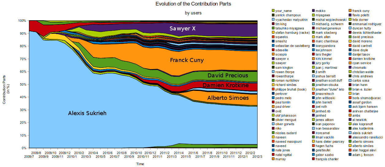
Overall contribution by users
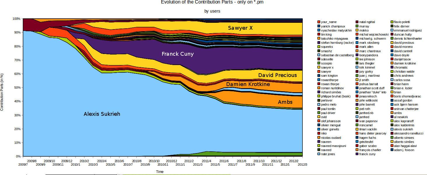
.pm files contribution by users
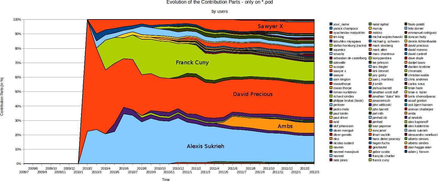
Pod files contribution by users
Test files contribution by users
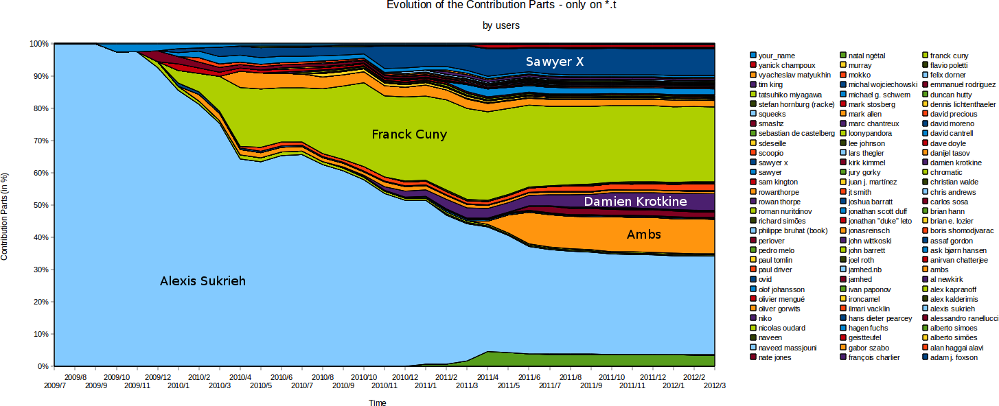
Reading these graphs
UPDATE : The surfaces represent a mean between the number of commits, and the weight of
modifications contributed (in term of “code line”), only when these are
original content addition. Moving content around isn’t counted as active
contribution.
Note that some people are registered twice with different names, I’ll try to
post an updated version
What does that demonstrate ? It shows that Dancer is really powered by its
community. Decisions are made together, the code is hacked by multiple hands,
and the management is done in a collegial manner on github.
It’s a great reward to be visible on these graphs :)
More Graphs
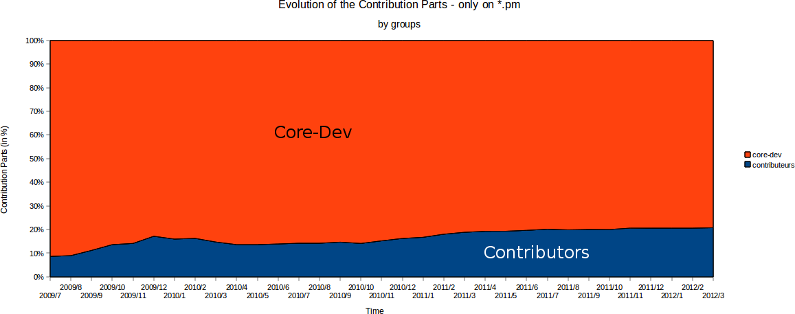
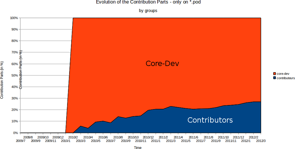
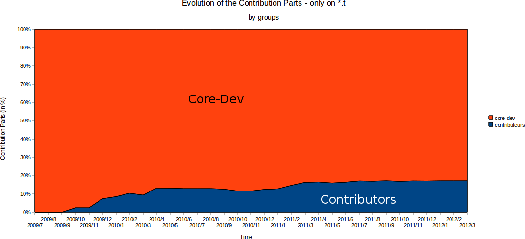
UPDATE : Erwan (@Labynocle) sent me new graphics, they show the difference
between core devs and contributors. By the ay, Erwan will be at the
French Perl Workshop in Strasbourg, France.
So here we go :
.pm files contribution by groups
Pod files contribution by groups
Test files contribution by groups
As a side note, I’ve proposed 2 talks related to Dancer for
YAPC::EU. One called “Dancer + WebSocket +
AnyEvent + Twiggy”, and an other one mixing Dancer, Log::Message::Structured and Message::Passing.
Let’s hope they’ll get accepted !